Support content case study

Redesigning a Toast POS Help Article

A speculative redesign of a public Toast POS help article focused on clarity, scannability, decision support, and just-in-time performance support for restaurant staff working under time pressure.

Project typeSpeculative redesign
RoleSenior Instructional Designer, solo project
FocusUX writing, content strategy, learning experience design
ToolsGoogle Docs, Canva Code, FireShot

Overview and context

The source article explained how to locate guest checks using multiple methods. The content was technically useful, but it created friction for users who need quick answers in a live restaurant environment.

Webpage previews

Compare the public source article with my redesigned mockup in the same view. The goal is to show how the same help topic can shift from dense support documentation into clearer, task-based performance support.

Original Toast help article

Public source article used for the speculative redesign analysis.
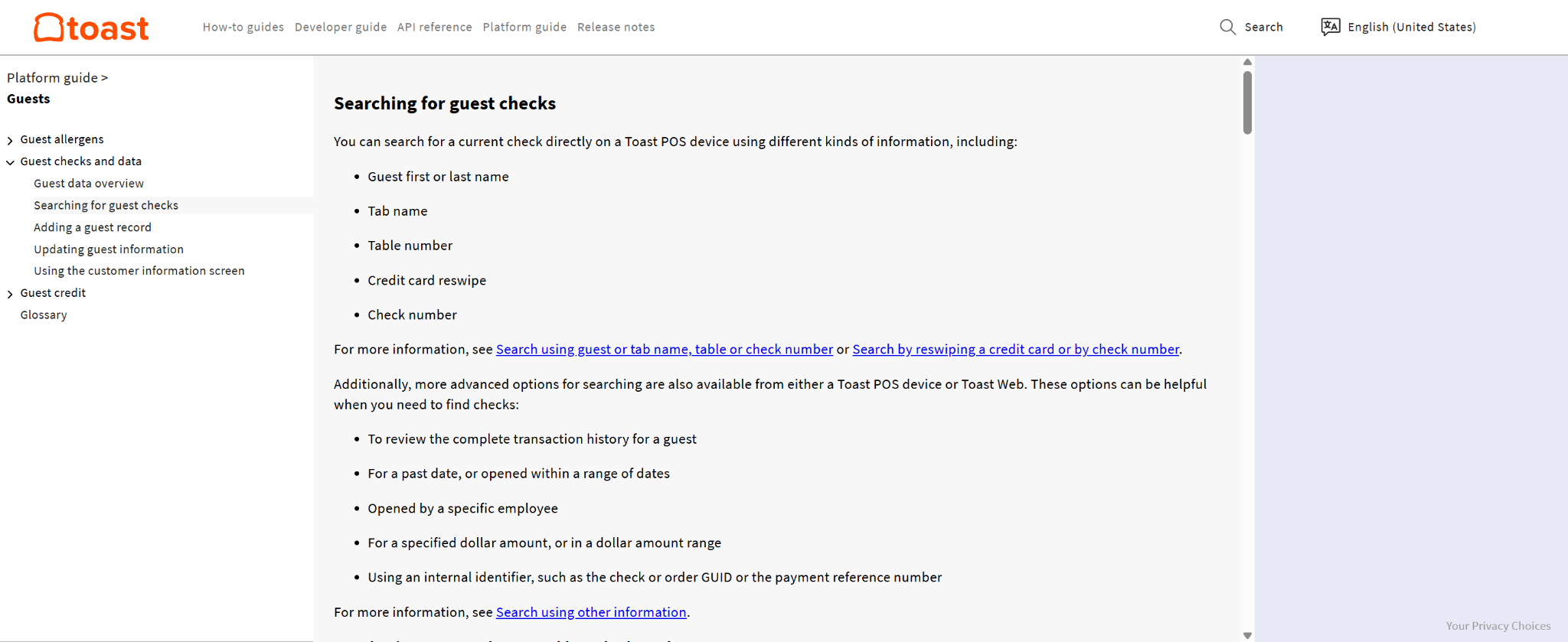
Preview screenshot of the original Toast help article for searching guest checks.

Redesigned mockup

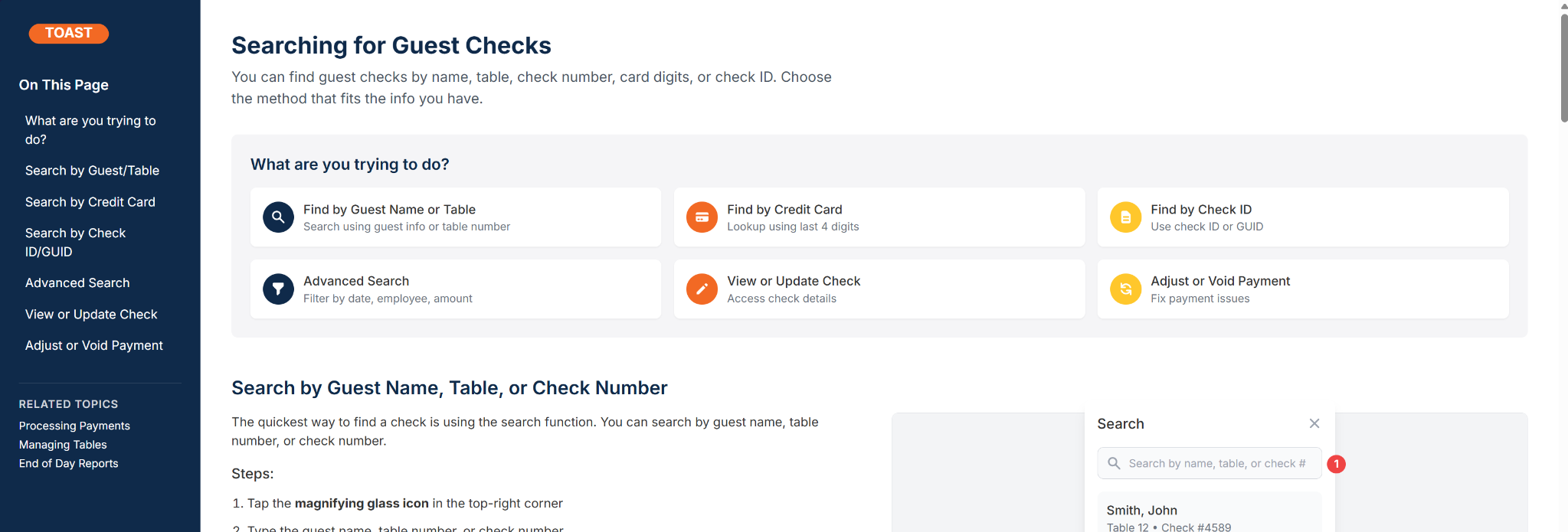
My mockup showing the proposed task-based structure, clearer wayfinding, and performance-support treatment.

Preview screenshot of Amanda Douvier's redesigned Toast help article mockup with task cards, sidebar wayfinding, and clearer search guidance.

Both previews are shown as screenshots so the comparison stays stable on the page. Use the buttons to open the live original article and the full redesign mockup.

Problem statement

The redesign focused on three usability risks.

ClarityDense paragraphs and passive voice made instructions harder to follow.
UsabilityInstructions were not structured for quick scanning or just-in-time use.
Visual supportScreenshots lacked highlights, captions, or close alignment with steps.

Design strategy

I approached the page as performance support, not just documentation. The goal was to reduce cognitive load and help staff choose the correct path quickly.

  • Use task-based headings and predictable step formatting
  • Add progressive disclosure through modular sections
  • Use active voice and plain language
  • Add a decision tree for choosing the right search method
  • Annotate screenshots with callouts, captions, and step alignment
  • Make access requirements visible before the user starts the task

Before and after structure

BeforeA longer explanation introduced multiple search methods in paragraph form, which required more reading before action.
AfterA task heading, short context sentence, access requirements, numbered steps, and tips made the same action easier to scan.
New decision aidA branching guide helped users choose quick search, credit card lookup, check GUID lookup, or advanced search based on what information they had.

Expected result language

This was a speculative portfolio redesign, so no production analytics are claimed. If implemented, I would measure whether the redesign improved task speed, reduced search errors, and increased confidence when staff use POS support content under pressure.

  • Time to retrieve a guest check
  • Search method selection accuracy
  • Helpfulness ratings on the article
  • Reduction in repeat support questions
  • Content quality rubric before and after redesign

What this demonstrates

  • Performance-support thinking for frontline software workflows
  • Instructional design applied to help documentation
  • UX writing, scannability, and plain language judgment
  • Accessibility-minded screenshot and layout recommendations
  • Honest speculative-result framing

Downloadable source file

This page summarizes the work sample for quick portfolio review. The full DOCX is available as a source document.

Full case study document

Download the complete Toast help documentation redesign case study with analysis notes, rewrite examples, and redesign rationale.

Download DOCX

Back to Work Samples

Return to the main portfolio to browse the rest of the project cards and supporting samples.

Back to Work Samples